Branding
2019 Evergreen State Fair
Bus Advertisements
These advertisements were created for Sound Transit and King County Metro. The Full Backs were designed to have a lot of visuals to look at while waiting behind the bus in traffic. It carried the “Monroe or Bust” Campaign and offered fun fair pictures to give the viewer the idea that they just gotta get there! The Sound Transit Double Talls featured our Evergreen State Fair Concert series and our “Monroe or Bust” Campaign. These were designed more like a film strip with large photos and not a lot of text so the viewer get the information while the bus was on the move.
Our Kings featured both the “Monroe or Bust” Campaign and The Aloe Blacc Concert. They were designed to have a lot of great photos that would be visible when you pulled up next to it on the street.
425 Magazine and Seattle Magazine
Print advertising for the 2019 Evergreen State Fair. Full page advertisement for 425 used the “Monroe or Bust” Campaign. It consisted of a typographic element of all the fun events at the fair, beautiful photos that captured the essence of the Evergreen State Fair and of course the tag, Monroe or Bust! You just gotta get there.
For Seattle Magazine I designed two different Aloe Blacc Concert advertisements to promote this amazing concert.
Covers of magazines were design by the teams at 425 and Seattle Magazine.
Big House Brewing
Created a logo for an existing brewery that my clients recently purchased. The previous owner did not have a standard logo that he was using and the brew pub was not under the same name as the brewery. My clients wanted to bring the brew pub and brewery under the same name and create a logo that could grow with the business.
It was important to create mood boards because it really was a blank slate and there were so many ideas that they had. This allowed us to zero in on a couple of designs. In the end they chose two of the logos that could translate into logo wear, promotional items such as coasters, growlers and pub glasses.
The color palette was kept very simple and clean with a burnt orange being the only color. The use of a bold typeface throughout all logos tied them together and allowed the name to be clearly read.
Washington Student Cycling League
Partnered with Primal Wear Inc. to create promotional hoodies and jerseys for the Washington Student Cycling League. Using the WSCL brand guidelines I created three different items that carried through the same theme but each a little different to appeal to a diverse group. Templates were provided by Primal Wear Inc. and I prepared files for production.
Championship Jersey
Keeping with the WSCL brand guidelines I created this jersey to stand apart from the promotion items but maintain a common thread of color. The league did not want anything that was too “bikey” and so I created a geometric pattern and used gradients to give it some depth. Templates were provided by Primal Wear Inc. and I prepared files for production.
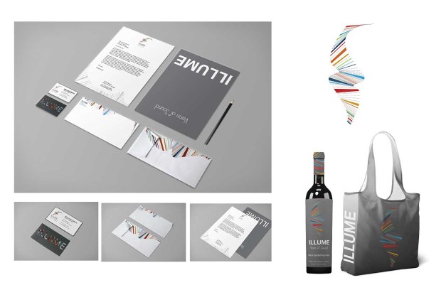
Illume- Vision of Sound

Branding package created for fictional rock symphony.
This was a branding project for a fictional Rock Symphony called Illume. The logo was created first and inspired by the Visionary archetype. It represents what sound would look like if one could see it. I wanted it to have a sense of fluid movement.
That same principle was then translated into the business papers and promotional items. The creation of each piece was approached as an experience, much like going to a concert. The business card has a die cut sleeve with the symphony’s name and as the card is being pulled from the sleeve the colors on the back of the card move through the the die cut. The letter head is folded so that as you pull it from the open end envelope you are presented with the company’s name and vision statement.
This movement carries on to the wireframes for the website. The logo is on the edges of the frame as if it is moving through the screen. The page for upcoming events rotates through each event and a quick access to buy tickets. I wanted to create a website that was very visual and user friendly while giving a feel for this very unconventional symphony.
Business Papers Package
Wireframes for website
Striped Hat Photography
Striped Hat Photography is a local area photographer that specializes in family, high school and fantasy photography. I was asked to design a logo that would represent the fun, whimsical style of her photographs. A logo soon became a branding package that she could use as her business grew. I created the logo, defined the color palette and created business papers that would highlight her type of work. I also created the wireframes for the website for her to develop at a later date.


